How Newspapers used Interactive Content to cover the Olympics


|
Much of the world has been focused on races, events, and medal counts in the capital of fun in Brazil for the past month.
Since the Olympics were on the minds of everyone, it’s no surprise that a number of media outlets looked to grab the attention of the masses.
There were a handful of newspapers that really took their Olympic-based content to the next level, and no surprise here, most of them jumped on interactive marketing to do it.
Take a look at some of the content that has been popping up over the last few weeks that has embraced interactive content marketing.
New York Times
If you’re anything like me, there’s no doubt you’ve seen the New York Times incredible selection of content around the games.
While they have embraced interactive content in past games, they’ve really been able to go to another level for Rio 2016.
Here are two of their more popular pieces:
Usain Bolt Timer
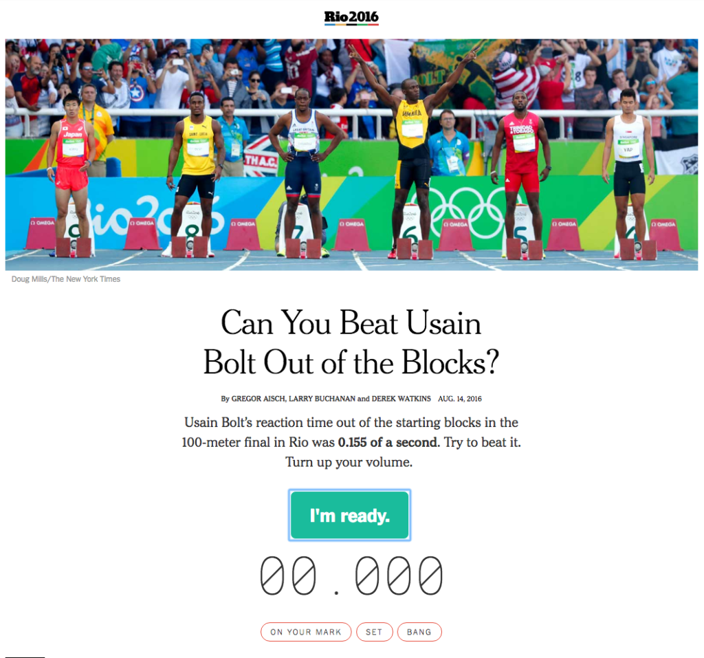
It shouldn’t come as a shock to anyone that, once again, Jamaican sprinter Usain Bolt is the fastest man in the world. But, it’s hard to get an idea of just how quickly he needs to react to the starting gun…unless you can try it out yourself.
That’s where the recent Times piece “Can You Beat Usain Bolt Out of the Blocks?” succeeds.
What makes this so great is how simple it is. It’s a straight up time test, and yet I’ve played this about 24 times over the past few days trying to get faster and faster.
It also succeeds in making the results somewhat personal. You can see there that my time is just a bit over Bolt’s, but rather than leaving it at that, it comments about how “Tokyo 2020 is in your sites.” If your score is quicker than Bolt’s then the message is different, and if you “false start” there is yet another message.
Women’s Water Polo Aggressiveness
The Times took a different approach when it came to creating an interactive story about Women’s Water Polo.
This is a sport that has two major problems going for it; first, it’s not incredibly popular in the United States so most don’t know much about it, and second, most of the action actually takes place below the water line.
That means it’s difficult for a casual viewer to grasp exactly how physical and draining the sport actually is.
The interactive article “Water Polo is as Shocking as You Think it Is” fills the post with gif images that highlights exactly what is going on just below the surface.
Here’s an example:

All quiet, right?
Well until woman in blue tries to drown the woman in orange in the middle of the match! By using gifs, the Times is able to make something that is very difficult to conceptualize and explain to a casual viewer, in a very clear and emotionally surprising way.
Hindustan Times
The Hindustan Times also created a great interactive piece of content that was centered around the men’s 100 meter dash sprint.
They collected data on the fastest sprinters from around the world and plotted them in an article called “Every Country’s Fastest Man in One Race.”
Here’s a look at the start:
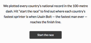
Once you click the “Start the race” button you can watch the race in real time.
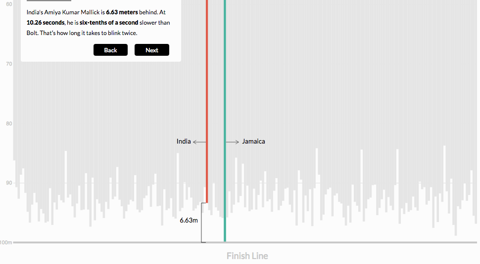
At the end, they also include a number of cool facts specifically about India’s fastest man, Amiya Kumar Mallick.
This piece of content does a great job not only creating something that is interactive and very visually appealing, but it also goes right to a common emotional touchstone for it’s audience. By featuring India’s fastest man it builds a connection with it’s reader base, and makes it far more likely they will remember that stat.
The Detroit News
Speaking of trying to appeal to the emotions of their readers, The Detroit News created an interactive map that showcases exactly where Michigan based Olympians live, who they are, and the dates and times they compete.
It’s called “Michiganians at the Rio Summer Olympics – An interactive map” and is a very good idea on hitting those emotional points for their readers. Of course, most Americans are going to be cheering for Team USA, but we always give a little extra cheer to those athletes that have a local connection.
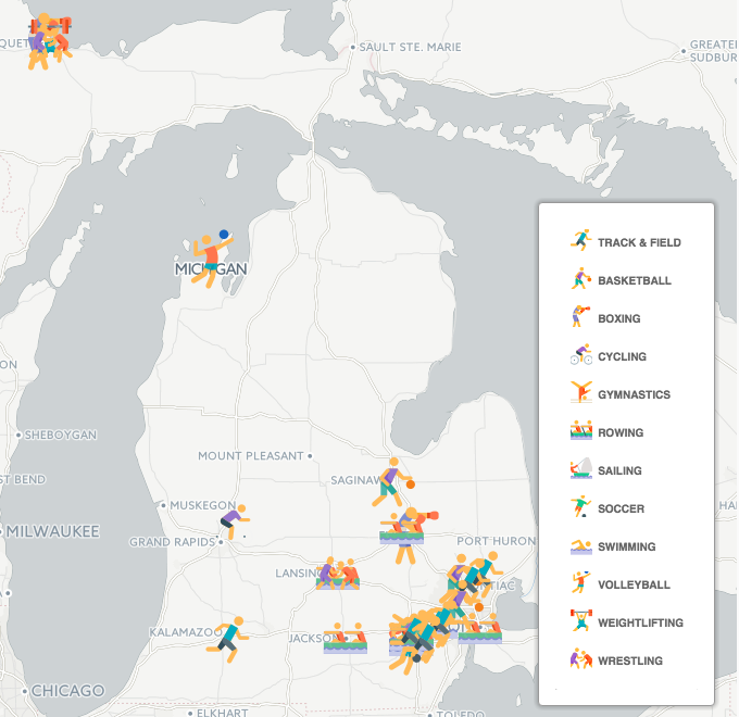
When you zoom in on the map and click on a particular athlete, even more information is displayed. You can see their name, photo, sport, competition dates, mini bio, and social media account.
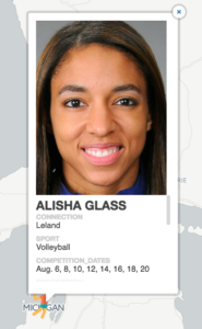
This is an incredibly easy way to get readers to get clicking all around the map. It helps locals track their favorite athletes, and it provides a potential for them to be able to interact with their Olympic hero’s online via their social media accounts.
This is one of the more simple examples of interactive content around, but that doesn’t make it any less effective.
Getting Interactive
This is one of the first games where a number of big (and small) publications are actively creating interactive content, and from the looks of it, seeing big wins.
Don’t be surprised to see this trend continue in the future, and not just for the Olympics. Interactive content is an incredible way to get readers clicking.
What’s been your favorite piece of interactive content for this Olympics cycle, share it with us in the comments!
|
|
