Alaska Airlines Mystery Deal: How Zembula Could Have Helped


|
Sometimes, businesses are so used to the tried-and-true that they don’t include new ideas or technology in their communications that their customers would love. Alaska Airlines made this mistake in a recent email communication sent out to their most loyal customers, their Mileage Plan members. Read on for what they did wrong (or just plain didn’t do!) and what Zembula could have done for them.
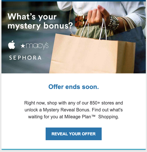
Alaska Airlines recently sent out a promotional email for their Mileage Plan Shopping hub. This offer included a “mystery reveal bonus”. The subject line actually works fairly well here, they include action words (unlock) and something to drive your curiosity (mystery bonus). Kudos, Alaska marketing team! Unfortunately, things go downhill from here.
This is the usual Alaska Airlines mileage template, so no surprises here. But the unfortunate part of this email is the lack of anything that would really make you want to click! The image is static and honestly kind of boring. The CTA might intrigue some people, but there is nothing about it that stands out in any way. The colors also just blend right into the rest of the template.
While this directs you to their website, it does so in the most straight-forward way possible, and unfortunately looks so much like their normal email communications that you might just skim over the CTA entirely!
If Zembula had been utilized in this email, not only would the image have been an animated GIF with fun imagery and eye-catching colors, but the CTA would have hopefully been a question or a challenge, something that catches the reader’s eye and conveys the idea that they’re getting a special, one-of-a-kind offer from you. After all, this is what interactive email is all about!

Once you click through Alaska’s offer, you’re directed to a landing page that lives on their website. This is what you would see:

Not a very great mystery, huh? Loading a static image with the deal stated outright doesn’t incite curiosity in the viewer, and delivers what should be an exciting deal in a completely forgettable way. In contrast, what you should have seen would have looked something like this:
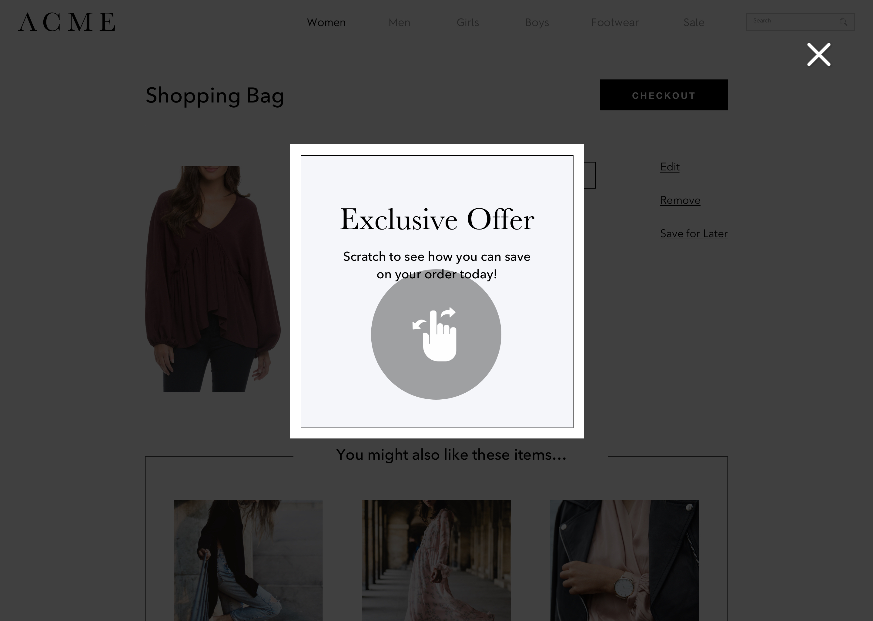
This takes you directly to the website still, but pops up an overlay that will have them interacting to reveal their mystery deal. And with Zembula, you can actually populate the discount randomly, revealing a true mystery deal for your viewers!
If you have been sending out lackluster mystery discount emails, you’re not alone. Luckily, Zembula is here to help! If you want to see how we’d tailor a mystery discount for you, just click here to chat with us!
|
|