3 Ways To Improve Your Completion Rates


|
We know it is the truth, even if it hurts – It doesn’t matter how much work you put into a marketing campaign if no one takes you up on your offer. And nothing is worse than sitting at your computer staring at analytics that are basically DOA after a painstaking and highly anticipated marketing campaign launch.
We want you to avoid that terrible feeling so we put together a couple tips to help you get the most bang for your buck and bump up your completion rates while using Zembula.
Design
First and foremost you need design that is on point. When it comes to creating a top-notch Zembula experience, or any marketing campaign really, you need to think about creating tension with your imagery. This can mean that you hide a portion of your offer. Give them a teaser, just not the entire thing.
Let’s go over well designed campaigns:
- Take a look at the example below.
This experience has tension and does a great job of inciting curiosity and FOMO (two of powerful drivers in human behavior.)
A chance at a discount: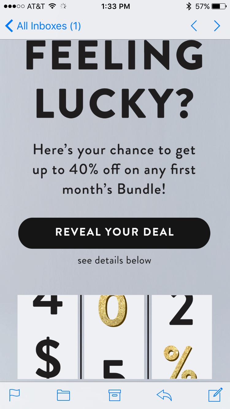
The design in this ad creates a little mystery and encourages action by rewarding users with a deal.
- A social media riddle:
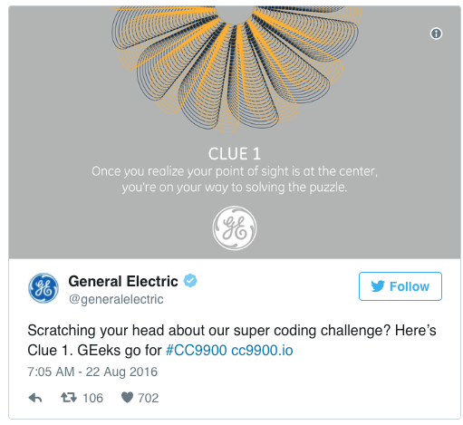
GE did a great job at keeping and holding attention with this riddle of a campaign. The image is vague, yet makes the reader wonder about the answer to the clue! - Gamified cuteness:
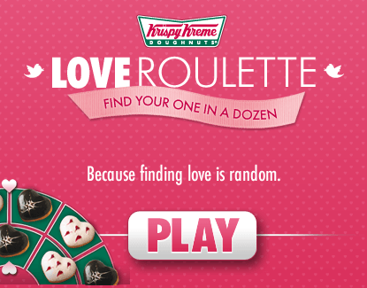
Krispy Kreme got views to play their Love Roulette game by using a design that struck just the right balance between hinting and hiding.
Now, let’s check out some campaigns that could use a little help:
- Check out the experience below:
This experience has way too much copy on the cover image and no design. Once you interact, it really lets you down with a bland looking offer.
- Giving it all up:

They give it all up from the start! There is no wonder, and no reason to continue engaging. The user engagement stops before it really even begins. - Leaving it ALL out in the open:

This add really has no tension. It just puts it all out there. The most tragic part of it all, the design takes a back seat to all the copy. Really, the best ad campaigns balance their message with words and visuals. Let your visuals do some of the talking! - A scratch-off gone wrong:
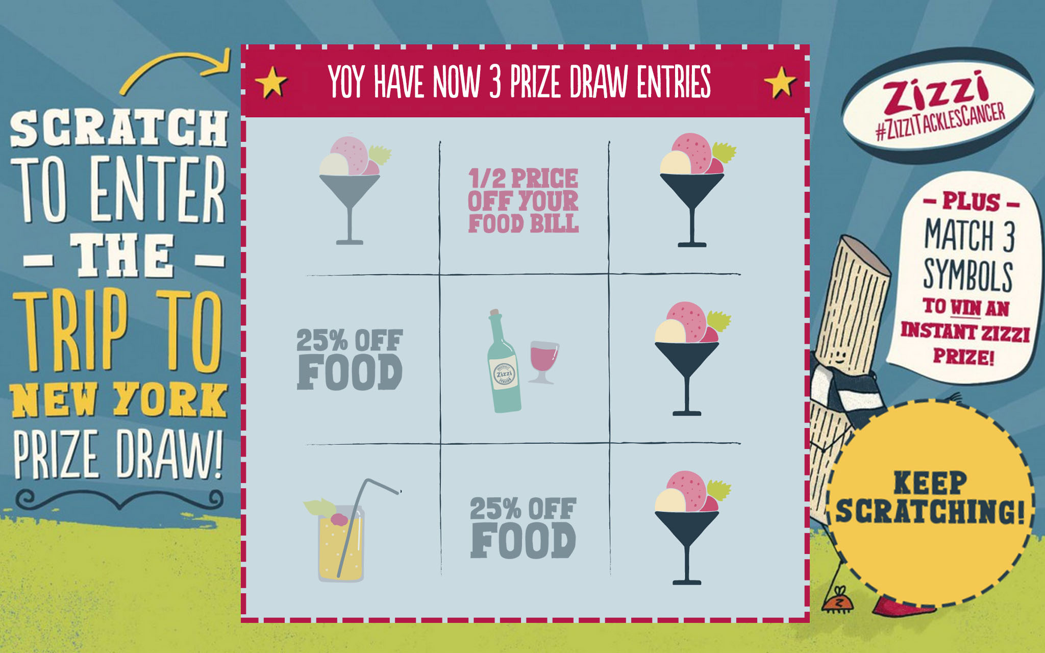
This ad tries really hard to draw out tension, but it just falls short. First and foremost, it is really confusing. The scratch area is inconsistent and already has some offers exposed, killing any tension that might have been created due to the scratch-off that is there.. It looks rather spammy.
Key Takeaways:
- Make something that is visually interesting, or at the very least, nice to look at..
- Hide a portion of your message, but allude to it in your design to create tension.
- Avoid too much text.
- Want more tips? Check this out.
Segment your audience:
What do you know about who you are targeting? Discovering your audience’s preferences is crucial for being able to iterate and send better, more relevant messages to them.
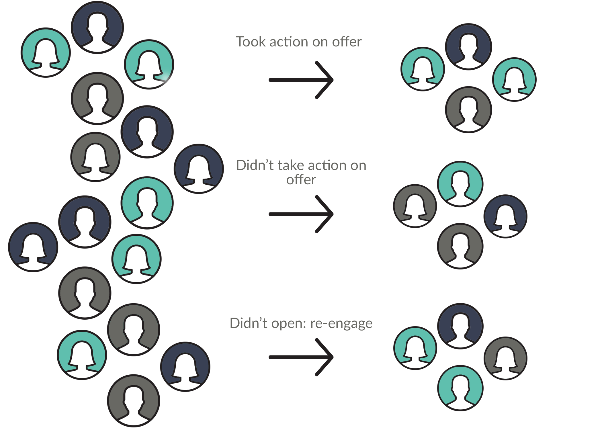
Figure out what different visitors or recipients like based on actions that they take or don’t take, then create your next campaign with that in mind. Your messaging, design, and calls-to-action will feel more personal and that will boost your completion rates.
Key Takeaways:
- Keep track of who opens, interacts, and ignores your communications.
- Segment your lists on a regular basis to make sure you are as relevant as can be.
- Tailor your communications to each group for better conversion rates.
Write better copy:
Words matter! Your copywriting needs to be concise and simple, yet persuasive. Think of it this way – you are having a casual conversation with a friend that you want to try something or agree with you about something. Approaching it this way will encourage a conversational tone and help you build trust with your audience.Remember to be the authority on the subject you are talking about to boost trust, and that it usually takes a little give to get.
Check out these examples of great copywriting:
- Sparking controversy in a good way
This ad is very cheeky. A play on words is sometimes a gamble, but it really worked in this instance because the brand incorporates a very important element – humor. I’d say it was a risk that paid off! This example wins at being conversational. - An artsy email:
Talking to your audience like humans pays off. Use words and phrases that they understand. You can even add a social buzzword, or other topical info to relate to your audience on a deeper level.
Now, here are some bad examples of copywriting:
- Complicated plus uncertainty
This example is not great because it comes off too wishy-washy right off the bat. In fact, I think the smaller headline would have been a better choice as the main copy. The main headline is also clunky and hard to digest. The first sentence of your copy is not a great time to have your audience get confused or frustrated. Simple is better. - Saying too much
Here is an example of what it looks like when you have too many things to say in too little space. You really only have a couple of seconds to get your audience’s attention, and then you only have a few more before they move onto something else. This ad has way too much copy and probably is skipped over entirely by most people. Great ad copy is simple, straightforward, and short!
Key Takeaways:
- Keep it simple. Less is usually more.
- Use a conversational tone. Being too formal can turn people off.
- Don’t be afraid to take a couple risks, especially if they are funny and in good taste.
And lastly, if you’re marketing the same thing, with the same subject line, creative, and approach time after time, you can expect diminishing returns on your efforts. You need to think a little outside the box and hone in on your creative abilities.
|
|