

The Ultimate Guide to Email Personalization for Marketers
You want to do more with youre emails, right? So it’s time to go deep with email personalization. Learn how email personalization helps marketers convert.

Every email personalization guide published in the last five years follows the same playbook: build better triggered flows. Optimize your abandoned cart. Tune your welcome series. Add a post-purchase sequence. And the personalized email marketing statistics they cite all point the same direction, because those flows do convert well. Personalized emails deliver 6x higher transaction rates than non-personalized ones, according to Instapage’s 2025 data. Segmented campaigns generate up to 760% more revenue than batch-and-blast.
Here is the problem with that playbook: every major retailer already runs those flows. They are table stakes. And they represent only 2–5% of total email send volume. The other 95% of your email program, the daily broadcast sends to your full subscriber list, ships with at most two audience segments and zero block-level personalization. That gap between what you’ve personalized and what you haven’t is where the real revenue opportunity sits. McKinsey (January 2025) documents 10–17% revenue uplift for companies mastering real-time personalization, and fast-growing companies generate 40% more revenue from it than slower-growing competitors. Applied to broadcast volume, that math compounds to $3–6 per subscriber per year in real revenue.
This guide is a full rebuild. Not another triggered-flow tutorial, but a framework for thinking about email personalization where the volume actually is, measured with the metrics that actually prove ROI.
What Personalized Email Marketing Statistics Actually Tell Us (and What the Old Definition Gets Wrong)
71% of consumers expect personalized communications from brands (Instapage, 2025). 52% of consumers will switch brands if emails aren’t personalized (Mailmend, 2026). These numbers get quoted a lot. What they don’t tell you is that the baseline definition of “personalized” has shifted. A first-name merge tag in the subject line was novel in 2016. It’s invisible now. Two audience segments (men/women, active/lapsed) are expected, not differentiated.
What changed is the environment around personalization. The inbox is more crowded: 376 billion emails sent daily in 2025, up from 206 billion in 2015. Apple Mail Privacy Protection invalidated open rates as a trust signal by pre-fetching images for a large share of iOS subscribers, inflating open rates roughly 18 percentage points. And paid-ad CAC inflation (Shopify merchants saw acquisition costs rise from $274 to $318 in a single year, per Shopify’s Global Commerce Report) is redirecting budget scrutiny toward owned channels. When average ecommerce ROAS falls to 2.87 across 13 of 14 industries, the CMO starts asking hard questions about where incremental budget should go.
The personalized email marketing statistics that matter now are the ones tied to revenue impact per content block, not per campaign. That’s a different conversation entirely.
The 95% Problem: Why All Your Personalization Lives in the 5% of Email That Already Works
Triggered flows (abandoned cart, welcome series, post-purchase) represent 2–5% of total retail email volume but generate 37% of email revenue. The per-send value difference is staggering: $2.87 per triggered send vs. $0.11 per broadcast send. Welcome emails alone generate 320% more revenue per message than standard promotional sends.
Those numbers sound like an argument to invest more in triggered flows. They are the opposite. They are the argument to personalize broadcast.
Every retailer already runs triggered flows. They are optimized, staffed, and delivering. The marginal improvement from further optimization is small. But the 95% of volume that is broadcast operates at $0.11 per send precisely because it ships with no content personalization. That’s a structural problem, not a creative one.
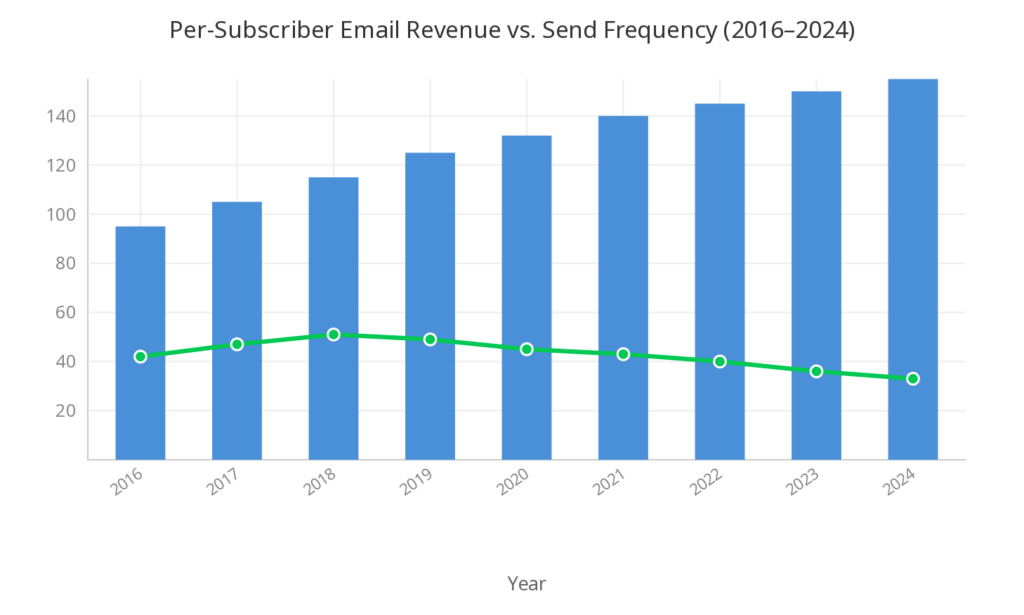
Here’s the volume trap in one chart: since 2016, sends per subscriber per year have risen from 95 to 155 (a 63% increase), while real inflation-adjusted revenue per subscriber has fallen from a peak of $51 in 2018 to $33 in 2024. More sends. Less value per subscriber. The industry response has been to send even more, which makes the per-subscriber economics worse.
McKinsey’s documented 10–17% personalization revenue uplift, applied to broadcast volume, is worth $3–6 per subscriber per year. For a retailer with 1 million subscribers, that’s $3–6 million annually, enough to reverse that 35% real per-subscriber decline. The path there isn’t more triggered flows. It’s block-level personalization across the sends you already make.
Stop Measuring Opens. Start Measuring Click-to-Conversion.
The two metrics email teams have relied on for years are both broken, for different reasons.
Open rates are inflated by Apple MPP, which pre-opens emails for a significant share of iOS subscribers. An 18-point artificial inflation means the number doesn’t represent human engagement anymore. It represents server behavior.
Click rates tell you which subject line won the inbox, not which content drove purchases. A high click rate on a promotional email with no conversions is a failure wearing a success metric’s clothes.
The metric that proves email content actually works is click-to-conversion (CTC): what percentage of email clicks convert to purchases. It strips out all the upstream noise (deliverability, subject lines, send time) and isolates the question that matters: did the content in this email cause someone to buy?
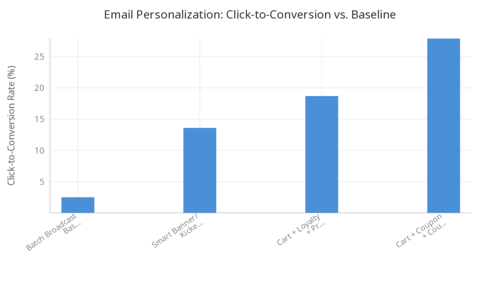
Industry baseline CTC for retail broadcast email is roughly 2.5%. Personalized Smart Banner and Smart Kicker content on Zembula’s platform averages 13.6% CTC, a 5.4x improvement over baseline. Multi-signal combinations push further: Cart + Loyalty + Price Drop hits 18.7% CTC. Cart + Coupon + Countdown reaches 27.9%.
CTC also unlocks RPM (revenue per thousand impressions), the email-side analog to paid-media ROAS. A $50+ RPM on a Smart Banner is a structurally better return on the impression than a 2.87x ROAS at current CPM levels. When your CFO asks you to compare email investment to ad spend, CTC and RPM are the numbers that translate. Block-level attribution makes this measurable at the content module level, not just the campaign level.
What Real 1:1 Personalization Looks Like: From Name Tokens to Open-Time Content
There are four generations of email personalization, and most brands are stuck between the first two.
Generation 1: Name tokens and segment copy. First name in the subject line, two or three audience segments, maybe a loyalty tier mention. Still useful. No longer differentiating. Every ESP supports this natively.
Generation 2: Behavioral triggers. Abandoned cart, browse abandonment, post-purchase, welcome. High CTC, but limited to the 5% of volume where the trigger event occurred. This is where every “email personalization best practices” article ends.
Generation 3: Open-time dynamic content. Content that renders at the moment of open, not at send time. A loyalty email opened three weeks after send still shows the current balance. An abandoned cart banner appears in a broadcast email even if the subscriber didn’t have items in their cart when the email was sent, because the cart state is resolved at open. More than 10% of email revenue comes from emails opened 7+ days after send. Send-time personalization misses all of it.
Generation 4: Image-based personalization. The same behavioral data rendered as a composed image rather than HTML. Brand fonts (not system fonts). Art-directed product photography with text layered over extended backgrounds. Custom pricing treatments. The same personalization logic, delivered as an image instead of an HTML block, drives 5–7% more conversions. That’s not a design preference. It’s a rendering architecture difference. HTML email can’t render brand fonts, can’t layer text over images reliably, and can’t deliver pixel-perfect layouts across email clients. Those constraints directly suppress conversion on personalized blocks.

Product Recommendation Emails: Why HTML Cards Underperform and What Replaces Them
HTML product recommendation emails have been the standard for years, and they represent a brand compromise that persisted because changing them felt expensive. System fonts instead of brand fonts. Raw PDP images pulled from the DAM without art direction. Layouts constrained by what Outlook and Gmail will render consistently. Spacing and visual hierarchy that never quite match the rest of the email template.
These aren’t aesthetic complaints. They suppress conversion. The same product recommendation email rendered as a composed image (brand fonts, layered pricing callouts, urgency timers, star ratings designed to brand spec) converts measurably better. The image approach also sidesteps Gmail’s 102KB clipping limit, which is a hard constraint for competitors who stack HTML blocks.

The test protocol for replacing HTML email product recommendations with image-based ones is straightforward. Step 1: replicate the existing HTML card as a Zembula image, straight replica, nothing added. Step 2: build the on-brand version with brand fonts, designed layouts, and pricing treatments. Step 3: run both as a longitudinal modular A/B test with subscriber assignment locked at first open and held constant across all subsequent sends. This isolates the rendering variable from all other factors. Longitudinal testing is important here because single-send A/B tests don’t account for novelty effects, and product recommendation performance varies by send cadence.
The Five-Phase Roadmap: From Smart Banners to Fully Personalized Broadcasts
Personalizing 95% of your email volume sounds like a multi-year infrastructure project. It doesn’t have to be. Here’s the phased approach, with concrete timelines and advancement criteria at each stage.
Phase 1: Smart Banners + Smart Kickers in every broadcast email. Ten-week launch timeline. Weeks 1–2: connect data feeds (roughly 30 minutes of IT time). Weeks 3–4: design and configure use cases. Week 5: UAT via preview link and one ESP test send. Week 6: go live across 100% of broadcast. Weeks 7–10: accumulate data. The Campaign Decision Engine auto-selects the right use case per subscriber at open across 100+ behavioral scenarios. The marketer doesn’t choose which use case per send. Zero daily workflow changes.
Phase 2: Personalized hero images in triggered emails. Cart, browse, post-purchase. The triggered flows already convert well. Image-based personalization makes them convert better.
Phase 3: Image-based product grids replacing HTML cards. This is where the product recommendation email upgrade happens, using the test protocol described above.
Phase 4: Category banners personalized to shopping affinity. Each subscriber sees the product category most aligned with their browsing and purchase history.
Phase 5: Personalized broadcast hero. Subject line, hero title, and hero imagery all coordinated per audience cohort. The most complex capability, but it builds on all the infrastructure from Phases 1–4.
Advancement criteria: 4+ weeks of positive RPM lift at Phase 1 before moving to Phase 2. Each phase builds compounding infrastructure, and rushing to Phase 3 without Phase 1 data means you’re guessing instead of measuring.
How to Prove Personalized Email Marketing Statistics and ROI to a CMO Who Thinks in Paid-Media Terms
This is the budget conversation the email marketer needs to win internally. Start with context the CMO already knows: average ecommerce ROAS fell to 2.87 in 2025 across 13 of 14 industries (Upcounting). Meta CPMs are up 20% YoY. Google CPCs rose 12.88% YoY (Search Engine Land). CAC is up 40–60% since 2023. iOS ATT means only 40–60% of conversions are even visible to ad platforms (Ruler Analytics). The CMO who funds both the ad team and the email team is already asking where incremental performance budget should go.
Email’s documented ROI of $36–40 per dollar dwarfs paid media’s roughly $2.50. But that’s a channel-level number. What the CMO wants is creative-level performance data, the same granularity they get from ad platforms. Module-level RPM on personalized content is the email analog to ad-platform ROAS at the creative level. A $50+ RPM on a Smart Banner, measured across millions of impressions with 7-day click-based attribution, is a structurally superior return vs. a 2.87x ad ROAS at current CPM levels. The top-performing RPM variant on Zembula’s platform (Cart + Loyalty + Price Drop) hits $469.65 RPM. Even the lowest-performing variant (Cart + BNPL at $31.42 RPM) outperforms the paid-media alternative.
The measurement infrastructure that makes this case credible: block-level CTC and RPM, 7-day click-based attribution, and directional confidence from sustained lift across 4+ weeks and millions of impressions. Marketers using AI for email personalization reported a 41% increase in revenue and 13.44% higher click-through rates, according to Statista data cited by Tabular Email.
The pilot framing for getting budget approval: 10 weeks, roughly 6 hours of total IT effort, zero daily workflow changes after Week 6. Platform data shows a minimum 11x ROAS across programs at launch. That’s a testable, low-risk proposal with a clear measurement framework.
Key takeaways
- Triggered flows are table stakes. Every retailer runs them. They are 5% of volume and no longer a growth differentiator. The real personalized email marketing statistics opportunity is in broadcast.
- 95% of email volume ships with zero content-level personalization. That gap is worth $3–6 per subscriber per year, per McKinsey’s documented 10–17% personalization uplift.
- Open rates are broken. Apple MPP inflates them roughly 18 points. Click-to-conversion (CTC) is the metric that proves content ROI and translates to paid-media comparisons.
- Image-based personalization outperforms HTML. The same data rendered as a composed image vs. an HTML block drives 5–7% more conversions. Product recommendation emails are the highest-impact test case.
- Smart Banners average 13.6% CTC vs. a 2.5% broadcast baseline, a 5.4x improvement. Multi-signal combinations reach 27.9%.
- Start with broadcast, not triggered. Broadcast reaches 100% of subscribers, accumulates data faster, and the absolute revenue potential is 10x larger than optimizing flows that already perform.
- The pilot is 10 weeks. Roughly 6 hours of IT time. Zero daily workflow changes. Minimum 11x ROAS at launch. That’s a conversation any CMO should want to have.
Grow your business and total sales