


5 Ways to Feature Personalized Product Recommendations in Email
Generate more conversions by adding personalized product recommendations to your emails. We’ve got a few examples to get you started.
Most personalized product recommendations in email look like they were assembled by a database query, not a designer. You know the ones: a row of product images jammed into an HTML table, mismatched fonts, broken layouts on mobile, and a “Recommended For You” headline that screams “we ran an algorithm.” They work, technically. But they don’t look like they belong in the email. And that matters more than most teams realize.
The gap between what recommendation engines can do and what they look like in the inbox has been growing for years. McKinsey research found that 71% of consumers expect personalized interactions, and 76% get frustrated when they don’t receive them. But “personalized” doesn’t just mean “relevant product.” It means the experience feels intentional. The presentation needs to match the brand, not fight against it.
The good news: you can have both. Personalized product recommendations in email that are fully dynamic, data-driven, and 1:1, while still looking like your design team hand-crafted each one. The trick is to stop relying on HTML to do the heavy lifting and start thinking in generated images with layered data elements. Here are five formats that get this right, with real visual examples from brands using Zembula Dimensions.
Why HTML-Based Product Recs Sacrifice Your Brand
Here’s the core problem with how most email platforms handle product recommendations: they render them as HTML. That means your product name, price, rating stars, and CTA button are all built from live text, CSS, and table-based layouts. On paper, that sounds fine. In practice, it means your fonts won’t match (email clients ignore most custom fonts), your layout will break across devices, and your design team loses control over spacing, alignment, and visual hierarchy.
The result? Product recs that look like a bolt-on module, not a natural part of the email. Subscribers can tell the difference. They scroll past generic-looking product grids the same way they scroll past banner ads.
The alternative is image-based personalization, where each product recommendation is rendered as a generated image with data elements (price, ratings, badges, CTAs) layered directly onto the product photography. The image is assembled at the moment of open, pulling live data, but it arrives in the inbox looking like a polished creative asset. That’s the approach behind Zembula’s Composition Engine, and it changes what’s possible with personalized email content.
Single Product Cards with Lifestyle Photography and Layered Data
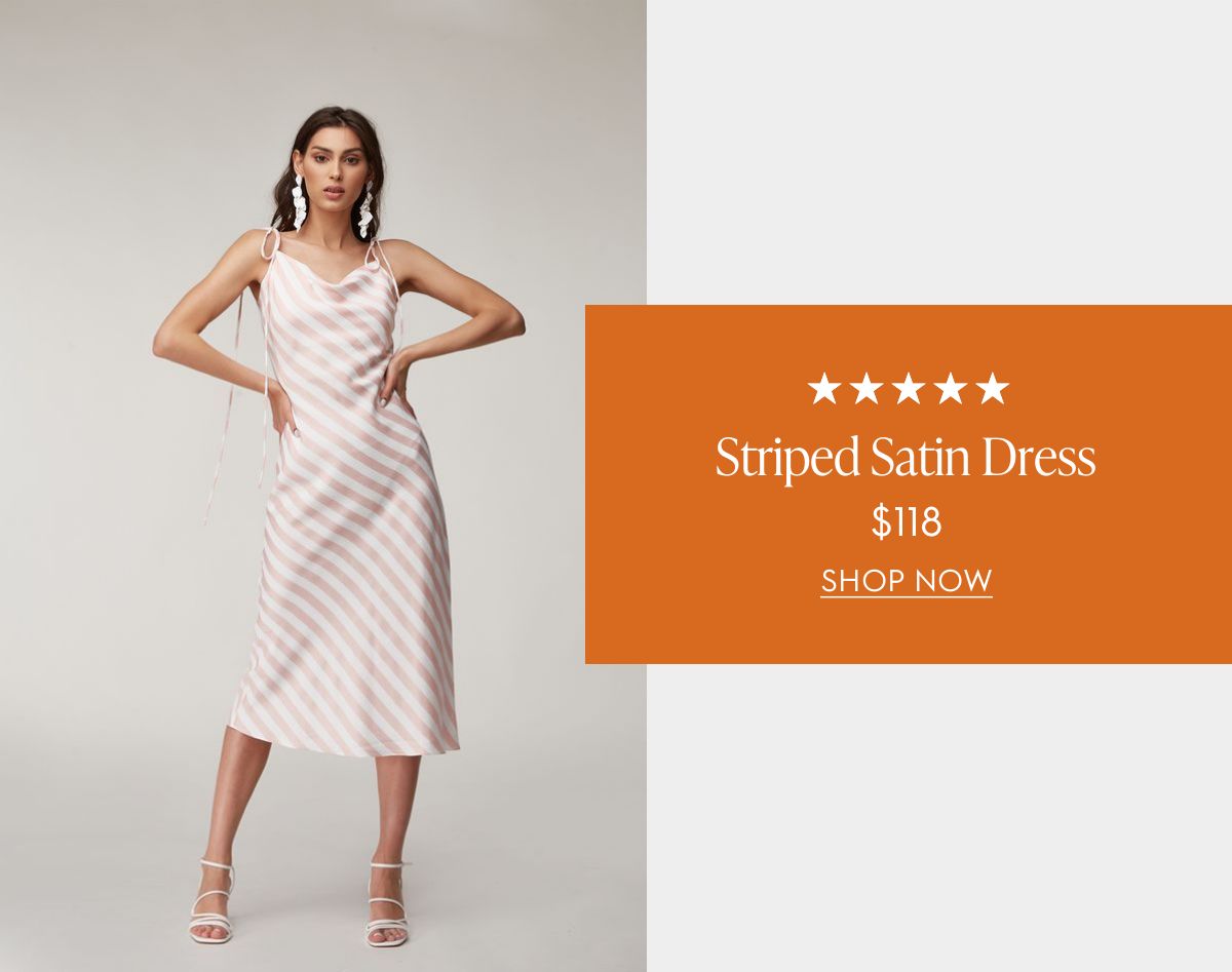
The single product card is the simplest format, and often the most effective. Instead of showing a grid of four or six items (which dilutes attention), you feature one product recommendation with full visual impact. The layout pairs a lifestyle photo with layered data: star ratings, product name, price, and a clear CTA.
The example below shows how this works. The lifestyle image (a model wearing the product) takes center stage, while the product data sits in a branded overlay card. Everything from the typography to the color palette matches the brand. The five-star rating and price are pulled live from the product catalog, but the end result looks like a designer placed each element by hand.
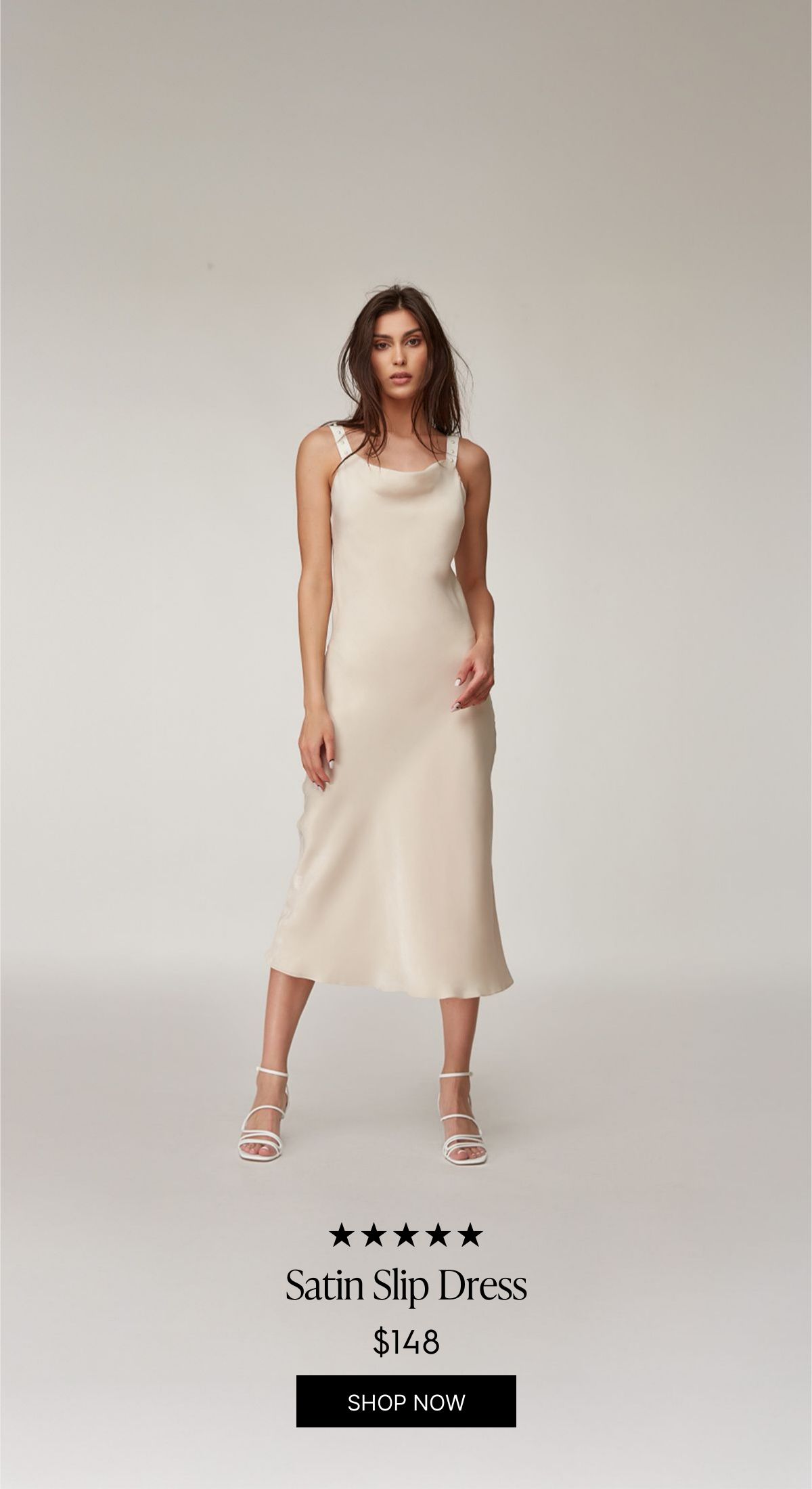
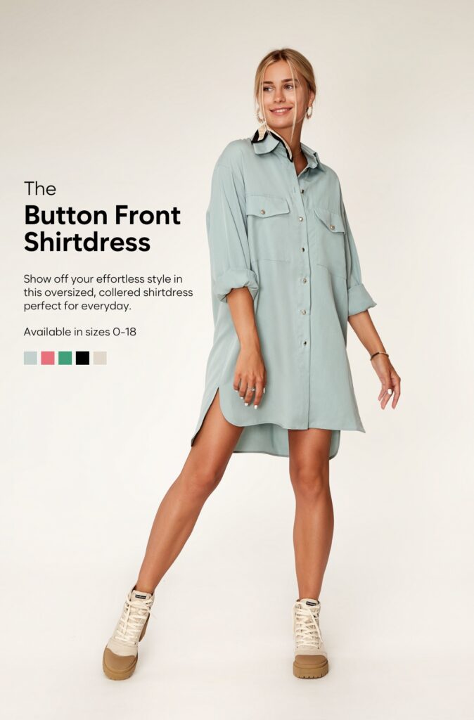
You can also go vertical. This full-height variant lets the product image dominate the frame, with the data elements (rating, name, price, CTA) sitting at the bottom. It’s a great fit for fashion and apparel where the product photography is strong enough to carry the layout on its own.
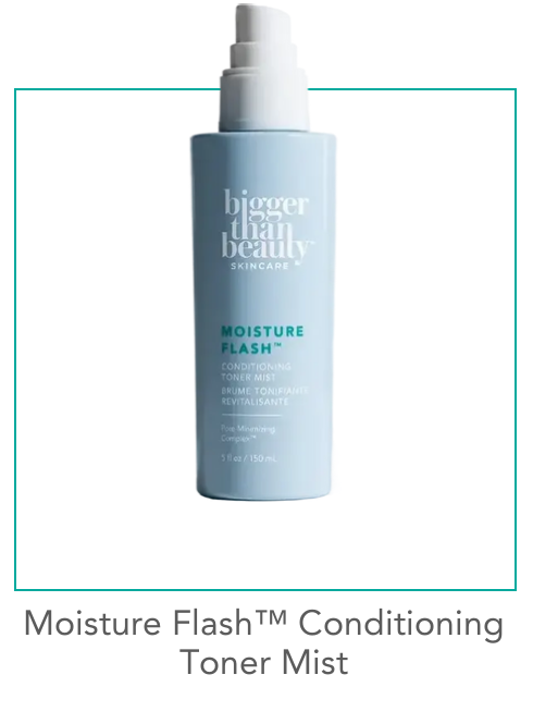
For beauty and skincare brands, a simpler studio-shot approach works well. This minimal product card uses a clean product photo on a white background with a teal accent border. No price shown, just the product name and framing that matches the brand’s visual identity. It’s the kind of personalized product recommendation in email that feels curated rather than computed.
Hero-Style Product Features with AI Background Extension
This is where things get interesting. A hero-style product feature fills the full width of the email, editorial-style, with the product as the star. The challenge has always been: how do you add dynamic text (product name, description, available sizes, color swatches) without covering the product itself?
The answer is AI background extension. Zembula’s Curator AI takes the original lifestyle photo and extends its background, creating additional canvas space where dynamic text elements can live. The model and product stay fully visible, while the extended area provides room for the product name, description, size options, and color swatches. All dynamically populated.
The result looks like a hand-designed editorial layout. You’d never guess that the background was AI-generated or that the text changes per subscriber based on their browsing and purchase history. This format is perfect for hero placement in daily sends, new arrival announcements, or high-margin products you want to feature prominently.
Multi-Product Grids with Badges, Sale Pricing, and Category Headers
Sometimes you do want to show multiple products. The key is making the grid feel curated, not auto-generated. That starts with a category header (“Accessories You’ll Love”) that frames the selection as an editorial pick rather than a data dump.
The example below shows a 2×2 grid of studio product shots, each with a product name, price, and CTA. But the detail that makes it work is the SALE badge on the handbag, showing the original price crossed out and the sale price next to it. These badges (sale, trending, best seller, low in stock) act as trust signals and urgency drivers. They’re the difference between a product grid that gets scrolled past and one that gets clicked.
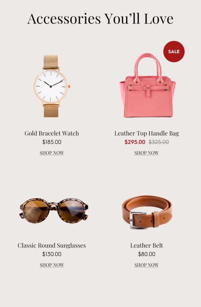
Because each product card is a generated image, the badge logic can be fully dynamic. A product that’s marked down gets the SALE badge automatically. An item with high recent views gets a TRENDING badge. Low inventory? LOW IN STOCK appears. The subscriber sees a polished grid that looks designed for them. Behind the scenes, every element is data-driven. This is what the Product Recs module in Zembula makes possible.
Stacked Vertical Recommendations That Match Your Brand Palette
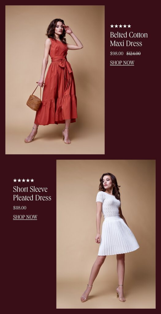
For brands that want to feature two or three products without the grid layout, stacked vertical recommendations are a strong option. Each product gets its own full-width row with a lifestyle photo, star rating, product name, and pricing (including strikethrough sale pricing).
What stands out about this format is how completely the recs adopt the brand’s color palette. Look at these two versions of the same layout. The first uses a rich maroon/burgundy background that matches a fall campaign:
And here’s the exact same data-driven layout, adapted to a warm beige palette for a different brand or campaign:
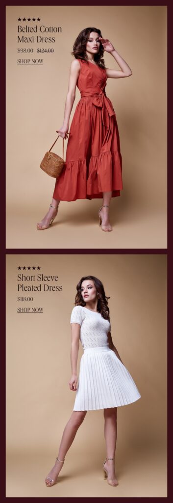
Same products. Same data structure. Completely different brand feel. This is the brand fidelity that HTML-based product recommendations simply can’t deliver. The background colors, photo cropping, text placement, and badge styling are all part of the generated image, which means they render perfectly in every email client, every time. According to Salesforce’s Connected Shoppers Report, personalization tied to strong visual experience is one of the top drivers of repeat purchase behavior.
Using AI to Crop, Extend, and Style Product Images at Scale
All of the layouts above rely on high-quality product imagery. But your product catalog probably has a mix: some items have great lifestyle shots, others just have a studio photo on a white background, and some have inconsistent sizing or awkward crops. That used to be a bottleneck. Now AI handles it.
Zembula’s Curator AI can do three things that make personalized product recommendations in email look consistently polished across your entire catalog:
- Crop products to transparent backgrounds, removing the original background so the product can be placed on any color or pattern that matches your email design.
- Extend backgrounds of lifestyle or studio shots, creating space for dynamic text elements without covering the product (as seen in the hero-style layout above).
- Standardize image dimensions and framing, so a 4-product grid doesn’t have one photo that’s zoomed in and another that’s tiny with white space around it.
This means your product recs flow as part of the overall email design. They don’t look like a third-party widget was dropped into the middle of your template. They look hand-picked and hand-placed, which is exactly the impression you want to create.
Layering Ratings, Badges, and Pricing Without Sacrificing Your Brand
Smart badges are one of the highest-leverage additions you can make to product recommendations. A “BEST SELLER” tag on a product card immediately communicates social proof. A “LOW IN STOCK” badge creates urgency. A “TRENDING” label makes the subscriber feel like they’re discovering something hot. And a SALE badge with crossed-out pricing drives conversions for price-sensitive shoppers.
The key is that these elements need to look like they belong. In an HTML-based system, adding a badge means adding another table cell or absolutely-positioned div that will render differently across Outlook, Apple Mail, and Gmail. In an image-based system, the badge is part of the generated image. It renders the same everywhere, with the exact font, color, and positioning your design team specified.
Across the Zembula platform, personalized content (including product recommendations with these layered data elements) averages roughly 18.3% click-to-conversion, compared to a 2.5% baseline for standard email content. That’s a 7x difference. The presentation matters. When the recommendation looks intentional and brand-aligned, subscribers trust it more, and they click.
Key Takeaways
- Stop relying on HTML for dynamic product elements. Generated images with layered data let you maintain brand fidelity while keeping every element personalized and dynamic.
- Single product cards with lifestyle photography create the strongest visual impact and work well for hero placements and high-value product features.
- AI background extension and product cropping solve the image quality bottleneck, letting you feature any product from your catalog in a polished layout.
- Smart badges (trending, best seller, sale, low in stock) add social proof and urgency without requiring manual design work for each product.
- Stacked vertical formats and multi-product grids should adopt your brand palette completely, making personalized product recommendations in email look like they were designed for each specific send.
- Consistency across email clients matters. Image-based personalization renders identically in Outlook, Gmail, Apple Mail, and everywhere else, unlike HTML-based dynamic content.
- The goal is to make every product rec look hand-picked. When the design is right, subscribers engage at dramatically higher rates. Zembula Dimensions makes this achievable at scale without adding work to your daily send process.
Grow your business and total sales