

Product Recommendation Email Examples: 8 Types That Drive Revenue
8 product recommendation email examples from retail brands, setup steps, and how to measure revenue impact. Learn why daily broadcasts beat triggers.
This guide covers the eight most effective types of product recommendation email examples in use by leading retail brands, with real-world implementations that drive measurable revenue. You’ll learn how to set up personalized recommendations, avoid common mistakes, and scale them beyond triggered flows into daily broadcasts.
Most brands limit recommendations to triggered emails like cart abandonment, representing less than 5% of total send volume. Worse, many render these blocks with broken layouts or outdated inventory, undermining trust and revenue potential.
What is a product recommendation email?
A product recommendation email is any email, triggered or batch, that shows a subscriber a set of products chosen for them based on behavioral data such as browsing, carting, purchasing, or loyalty activity. These recommendations can be generated at send-time or dynamically updated at open-time to reflect current pricing, stock status, and promotions.
Recommendations appear as embedded blocks such as product grids, single cards, or hero features, and can be placed in automated flows or in daily broadcast emails. Open-time rendering ensures the content reflects the live catalog the moment the subscriber opens the email.
Why product recommendation emails drive revenue
McKinsey research found that 71% of consumers expect personalized interactions and 76% get frustrated when they do not receive them. While triggered flows like welcome or cart abandonment are common starting points, they represent a small fraction of total email volume compared to daily broadcasts.
Zembula customers like SPANX personalize 100% of daily sends and achieve an 11.5% click-to-conversion rate on that content. esmi Skin Minerals sees click-to-conversion rates 5.8x above industry benchmarks and attributes 2.5% of annual revenue to personalized emails. Sephora UK achieves a 21% click-to-conversion rate on loyalty-driven recommendations.
Zembula guarantees a 10x return on spend, with an average customer result of 15x. J.Crew achieved 41x, Forever 21 saw 11x with a 19% revenue lift, Thrive Causemetics reached 12x with a 17% lift, and New York & Company achieved 14.5x.
8 product recommendation email examples by trigger type
1. Browse abandonment
This email shows products a subscriber viewed but did not purchase, often paired with urgency cues like low stock, ratings, or promotions. It recaptures interest before the customer moves on.
SPANX runs browse recovery banners inside its daily sends using Smart Banners™ at the top of the email and Smart Kickers™ at the bottom, each pairing the browsed product image with promotions, low-stock indicators, coupons, ratings, and loyalty elements. This approach moved browse recovery from a trigger-only flow into every daily send. Madewell pairs recently browsed products with a low-stock reminder inside its promotional emails.
Why it works: It turns passive browsing into actionable intent by meeting the customer where they are, even after they’ve left the site.
2. Cart abandonment
This email displays items left in the cart with pricing and stock status updated at the time of open. It ensures relevance even if the inventory or pricing changes after the cart was created.
SPANX brought abandoned cart recovery into its daily batch emails in addition to its triggered flow, increasing how often subscribers see those high-converting messages.
Why it works: By embedding cart recovery into daily sends, it increases visibility without relying solely on a single automated trigger.
3. Post-purchase and order updates
Sent after a purchase, this email confirms shipment status and includes a fresh set of recommended products tailored to the customer’s behavior. It keeps engagement high post-transaction.
Madewell uses dynamic content to show one customer a shipment update with personalized recommendations while another sees different content in the same email structure, all powered by real-time data.
Why it works: It turns a transactional message into a personalized merchandising opportunity, extending the customer journey beyond the first click.
4. Replenishment
This email reminds customers to reorder consumable products and shows the exact items or bundle they purchased previously. It simplifies repeat purchases for loyal customers.
esmi Skin Minerals uses a recommendation module in its replenishment template that pulls the exact historical bundle for each subscriber from thousands of possible combinations, turning replenishment into a consistent retention tool.
Why it works: It removes friction by surfacing the right bundle at the right time, based on actual past behavior.
5. Loyalty and rewards
This email combines product recommendations with loyalty data such as points balance, tier status, progress to next reward, or birthday offers. It strengthens emotional connection and drives action.
Madewell includes available rewards, benefit progress, and birthday incentives in daily promotional emails. Sephora UK integrates tier upgrades, reward thresholds, and lapse-risk messaging into every send, increasing purchase frequency by 0.5%. esmi Skin Minerals achieves a 19.2% click-to-conversion rate on loyalty content, 7.7x the industry average.
Why it works: It combines emotional incentives with personalized product suggestions to drive both loyalty and conversion.
6. Win-back and lapse prevention
This email targets customers who haven’t purchased in a while, using past behavior to suggest relevant products. It re-engages lapsed customers with personalized content.
Sephora UK follows customers at risk of lapsing with personalized content across every send, not just a single trigger. SPANX includes winback messaging in its standard launch banners and kickers, ensuring consistent re-engagement.
Why it works: By embedding win-back logic into ongoing sends, it maintains pressure without over-messaging.
7. New arrivals and curated daily picks
This email features a subscriber-specific grid of new arrivals or curated picks based on behavior, shown in the daily broadcast. It brings trigger-level personalization to high-volume sends.
SPANX uses recommendation blocks to deliver curated grids in daily emails covering new arrivals, category roundups, and promotions. This approach scales personalization beyond isolated triggers to every subscriber touchpoint.
Why it works: It transforms routine broadcasts into dynamic, one-to-one experiences that drive discovery and conversion.
8. Welcome and first-purchase
For new subscribers with limited behavioral data, this email shows best sellers or category picks. It uses fallback logic to maintain relevance even when no history exists.
SPANX includes welcome messaging in its personalized send program. A single recommendation block handles all subscriber types, from anonymous to offer-qualified, using dynamic fallbacks when behavioral data is missing.
Why it works: It ensures every subscriber sees relevant content from day one, regardless of data maturity.
What good product recommendations look like in the inbox
Most personalized product recommendations in email look like they were assembled by a database query, not a designer. You know the ones: a row of product images jammed into an HTML table, mismatched fonts, broken layouts on mobile, and a “Recommended For You” headline that screams “we ran an algorithm.” They work, technically. But they don’t look like they belong in the email. And that matters more than most teams realize.
The gap between what recommendation engines can do and what they look like in the inbox has been growing for years. McKinsey research found that 71% of consumers expect personalized interactions, and 76% get frustrated when they don’t receive them. But “personalized” doesn’t just mean “relevant product.” It means the experience feels intentional. The presentation needs to match the brand, not fight against it.
The good news: you can have both. Personalized product recommendations in email that are fully dynamic, data-driven, and 1:1, while still looking like your design team hand-crafted each one. The trick is to stop relying on HTML to do the heavy lifting and start thinking in generated images with layered data elements. Here are five formats that get this right, with real visual examples from brands using Zembula Dimensions.
Why HTML-Based Product Recs Sacrifice Your Brand
Here’s the core problem with how most email platforms handle product recommendations: they render them as HTML. That means your product name, price, rating stars, and CTA button are all built from live text, CSS, and table-based layouts. On paper, that sounds fine. In practice, it means your fonts won’t match (email clients ignore most custom fonts), your layout will break across devices, and your design team loses control over spacing, alignment, and visual hierarchy.
The result? Product recs that look like a bolt-on module, not a natural part of the email. Subscribers can tell the difference. They scroll past generic-looking product grids the same way they scroll past banner ads.
The alternative is image-based personalization, where each product recommendation is rendered as a generated image with data elements (price, ratings, badges, CTAs) layered directly onto the product photography. The image is assembled at the moment of open, pulling live data, but it arrives in the inbox looking like a polished creative asset. That’s the approach behind Zembula’s Composition Engine, and it changes what’s possible with personalized email content.
Single Product Cards with Lifestyle Photography and Layered Data
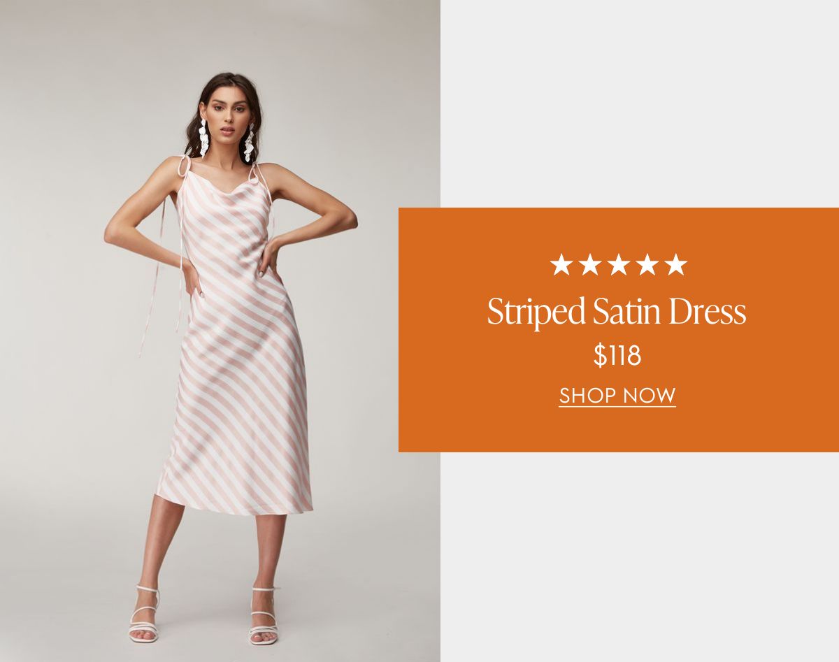
The single product card is the simplest format, and often the most effective. Instead of showing a grid of four or six items (which dilutes attention), you feature one product recommendation with full visual impact. The layout pairs a lifestyle photo with layered data: star ratings, product name, price, and a clear CTA.
The example below shows how this works. The lifestyle image (a model wearing the product) takes center stage, while the product data sits in a branded overlay card. Everything from the typography to the color palette matches the brand. The five-star rating and price are pulled live from the product catalog, but the end result looks like a designer placed each element by hand.
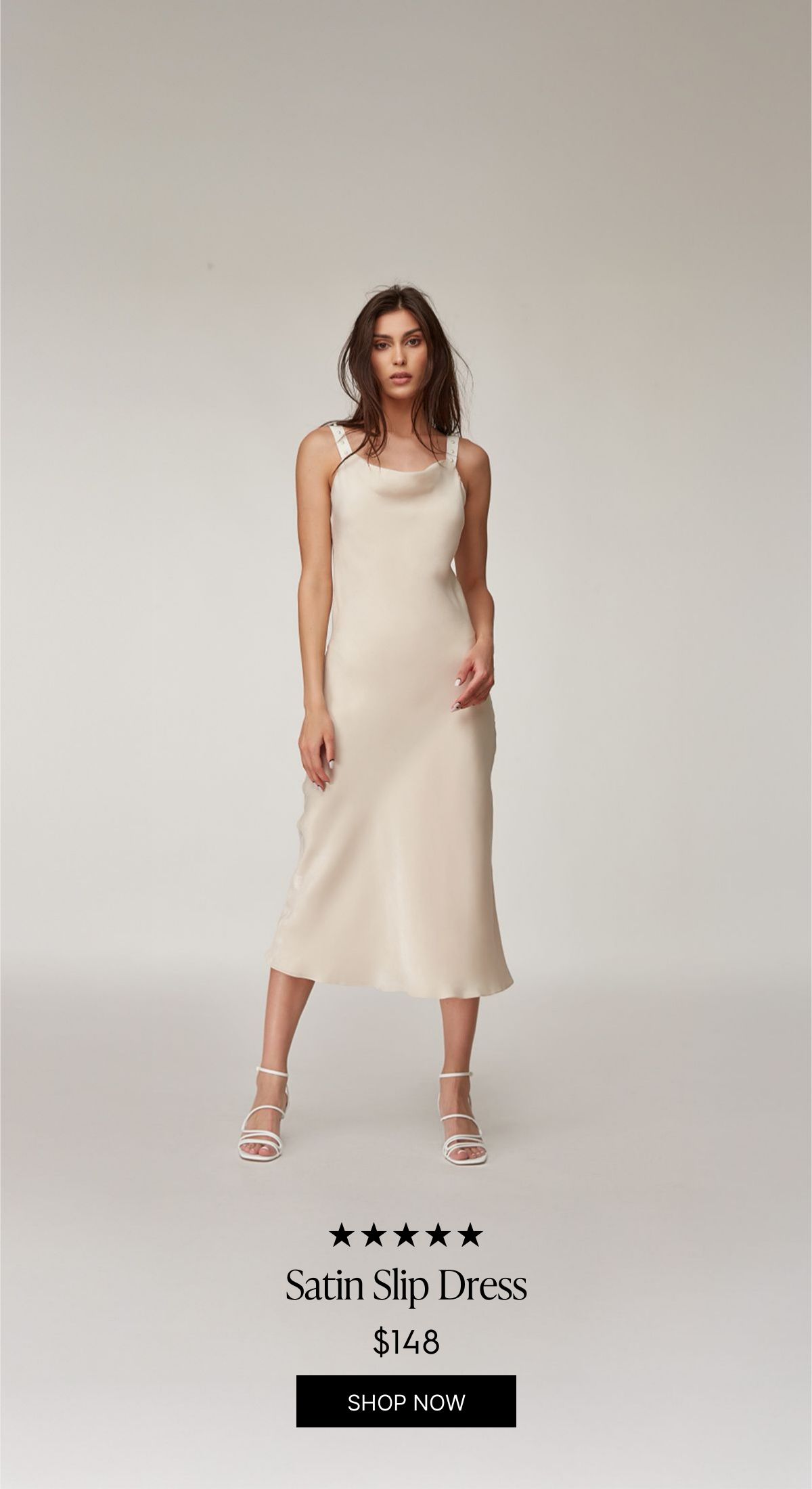
You can also go vertical. This full-height variant lets the product image dominate the frame, with the data elements (rating, name, price, CTA) sitting at the bottom. It’s a great fit for fashion and apparel where the product photography is strong enough to carry the layout on its own.
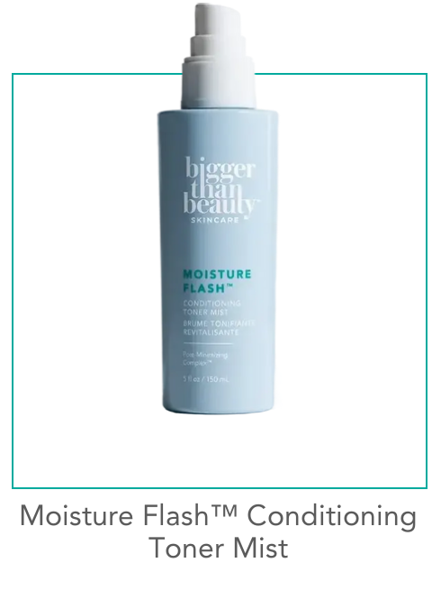
For beauty and skincare brands, a simpler studio-shot approach works well. This minimal product card uses a clean product photo on a white background with a teal accent border. No price shown, just the product name and framing that matches the brand’s visual identity. It’s the kind of personalized product recommendation in email that feels curated rather than computed.
Hero-Style Product Features with AI Background Extension
This is where things get interesting. A hero-style product feature fills the full width of the email, editorial-style, with the product as the star. The challenge has always been: how do you add dynamic text (product name, description, available sizes, color swatches) without covering the product itself?
The answer is AI background extension. Zembula’s Curator AI takes the original lifestyle photo and extends its background, creating additional canvas space where dynamic text elements can live. The model and product stay fully visible, while the extended area provides room for the product name, description, size options, and color swatches. All dynamically populated.
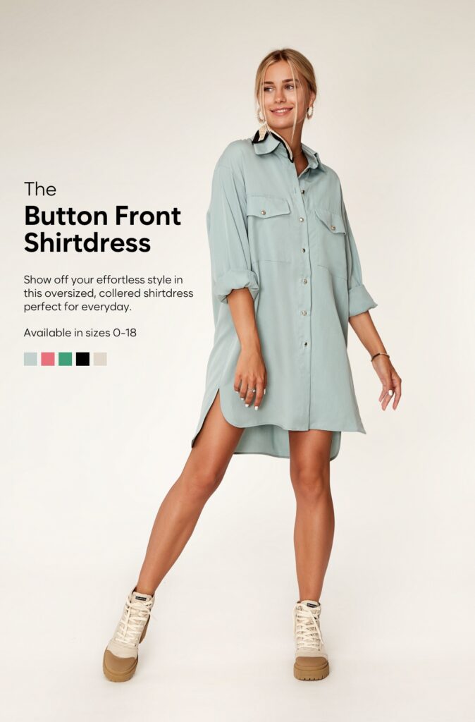
The result looks like a hand-designed editorial layout. You’d never guess that the background was AI-generated or that the text changes per subscriber based on their browsing and purchase history. This format is perfect for hero placement in daily sends, new arrival announcements, or high-margin products you want to feature prominently.
Multi-Product Grids with Badges, Sale Pricing, and Category Headers
Sometimes you do want to show multiple products. The key is making the grid feel curated, not auto-generated. That starts with a category header (“Accessories You’ll Love”) that frames the selection as an editorial pick rather than a data dump.
The example below shows a 2×2 grid of studio product shots, each with a product name, price, and CTA. But the detail that makes it work is the SALE badge on the handbag, showing the original price crossed out and the sale price next to it. These badges (sale, trending, best seller, low in stock) act as trust signals and urgency drivers. They’re the difference between a product grid that gets scrolled past and one that gets clicked.
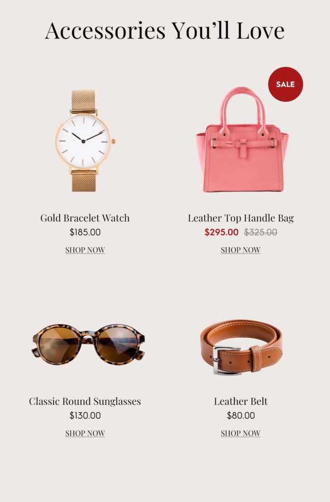
Because each product card is a generated image, the badge logic can be fully dynamic. A product that’s marked down gets the SALE badge automatically. An item with high recent views gets a TRENDING badge. Low inventory? LOW IN STOCK appears. The subscriber sees a polished grid that looks designed for them. Behind the scenes, every element is data-driven. This is what the Product Recs module in Zembula makes possible.
Stacked Vertical Recommendations That Match Your Brand Palette
For brands that want to feature two or three products without the grid layout, stacked vertical recommendations are a strong option. Each product gets its own full-width row with a lifestyle photo, star rating, product name, and pricing (including strikethrough sale pricing).
What stands out about this format is how completely the recs adopt the brand’s color palette. Look at these two versions of the same layout. The first uses a rich maroon/burgundy background that matches a fall campaign:
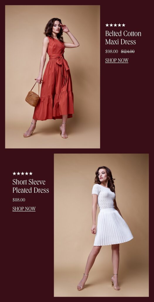
And here’s the exact same data-driven layout, adapted to a warm beige palette for a different brand or campaign:
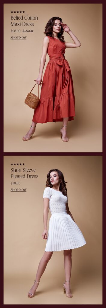
Same products. Same data structure. Completely different brand feel. This is the brand fidelity that HTML-based product recommendations simply can’t deliver. The background colors, photo cropping, text placement, and badge styling are all part of the generated image, which means they render perfectly in every email client, every time. According to Salesforce’s Connected Shoppers Report, personalization tied to strong visual experience is one of the top drivers of repeat purchase behavior.
Using AI to Crop, Extend, and Style Product Images at Scale
All of the layouts above rely on high-quality product imagery. But your product catalog probably has a mix: some items have great lifestyle shots, others just have a studio photo on a white background, and some have inconsistent sizing or awkward crops. That used to be a bottleneck. Now AI handles it.
Zembula’s Curator AI can do three things that make personalized product recommendations in email look consistently polished across your entire catalog:
- Crop products to transparent backgrounds, removing the original background so the product can be placed on any color or pattern that matches your email design.
- Extend backgrounds of lifestyle or studio shots, creating space for dynamic text elements without covering the product (as seen in the hero-style layout above).
- Standardize image dimensions and framing, so a 4-product grid doesn’t have one photo that’s zoomed in and another that’s tiny with white space around it.
This means your product recs flow as part of the overall email design. They don’t look like a third-party widget was dropped into the middle of your template. They look hand-picked and hand-placed, which is exactly the impression you want to create.
Layering Ratings, Badges, and Pricing Without Sacrificing Your Brand
Smart badges are one of the highest-leverage additions you can make to product recommendations. A “BEST SELLER” tag on a product card immediately communicates social proof. A “LOW IN STOCK” badge creates urgency. A “TRENDING” label makes the subscriber feel like they’re discovering something hot. And a SALE badge with crossed-out pricing drives conversions for price-sensitive shoppers.
The key is that these elements need to look like they belong. In an HTML-based system, adding a badge means adding another table cell or absolutely-positioned div that will render differently across Outlook, Apple Mail, and Gmail. In an image-based system, the badge is part of the generated image. It renders the same everywhere, with the exact font, color, and positioning your design team specified.
Across the Zembula platform, personalized content (including product recommendations with these layered data elements) averages roughly 18.3% click-to-conversion, compared to a 2.5% baseline for standard email content. That’s a 7x difference. The presentation matters. When the recommendation looks intentional and brand-aligned, subscribers trust it more, and they click.
Key Takeaways
- Stop relying on HTML for dynamic product elements. Generated images with layered data let you maintain brand fidelity while keeping every element personalized and dynamic.
- Single product cards with lifestyle photography create the strongest visual impact and work well for hero placements and high-value product features.
- AI background extension and product cropping solve the image quality bottleneck, letting you feature any product from your catalog in a polished layout.
- Smart badges (trending, best seller, sale, low in stock) add social proof and urgency without requiring manual design work for each product.
- Stacked vertical formats and multi-product grids should adopt your brand palette completely, making personalized product recommendations in email look like they were designed for each specific send.
- Consistency across email clients matters. Image-based personalization renders identically in Outlook, Gmail, Apple Mail, and everywhere else, unlike HTML-based dynamic content.
- The goal is to make every product rec look hand-picked. When the design is right, subscribers engage at dramatically higher rates. Zembula Dimensions makes this achievable at scale without adding work to your daily send process.
How to set up personalized product recommendations in email
- Connect your product catalog, including price, stock, images, and categories, along with behavioral data from browsing, carting, ordering, and loyalty systems, to your email platform or CDP. Zembula integrates with existing stacks like Salesforce Marketing Cloud, Klaviyo, Ometria, Shopify, and LoyaltyLion, handling data mapping automatically.
- Choose the recommendation logic for each placement based on behavioral rules such as browsed, carted, or purchased items, with fallbacks like best sellers or new arrivals when data is sparse. Machine learning is optional and not required for success.
- Suppress out-of-stock and delisted products, gift cards, samples, items already purchased, and any SKUs on an exclusion list to maintain relevance and trust.
- Design the recommendation block once with your brand’s fonts, color palette, badge styles, and image treatment so every product appears hand-curated. Refer to the visual-format sections on this page for implementation examples.
- Place the block in your master email template using a Smart Block™ in the body or a Smart Banner™ and Smart Kicker™ at the top and bottom, enabling every send, triggered or broadcast, to carry personalized content without campaign rebuilds.
- Measure results with a longitudinal holdout test before scaling. Assign audiences at first open and compare channel revenue over time. Zembula programs typically launch in 6 weeks and deliver holdout proof in 12.
How to measure whether product recommendation emails work
Opens and clicks do not confirm if a recommendation block drove revenue. The true measure is a longitudinal holdout test where one group sees personalized content and another does not, with channel revenue compared over time. Block-level attribution shows the product grid outearns other blocks.
Within the email, block-level click-to-conversion (CTC) and revenue per thousand impressions help identify top-performing placements and variants. These metrics guide optimization but do not replace the holdout. Why block-level CTC needs a different data stack than subject-line tests.
Product recommendation email mistakes to avoid
- Recommending out-of-stock or delisted products damages trust and creates frustration when customers click through to unavailable items.
- Showing products the customer just bought is a basic data error that signals poor personalization and can alienate repeat shoppers.
- Using HTML product cards that break across email clients disrupts brand consistency and makes recommendations look unprofessional.
- Running recommendations only in triggered flows limits their impact, as these represent less than 5% of total email volume compared to daily broadcasts.
- Judging performance by clicks alone ignores downstream revenue and can lead to scaling ineffective blocks.
- Failing to implement fallback logic for subscribers with no behavioral data results in blank or generic recommendations that miss personalization opportunities.
Product recommendation email FAQ
What is a product recommendation email?
A product recommendation email shows subscribers a set of products selected for them based on their behavior, such as browsing, carting, or purchasing. These can be triggered or batch emails, with products chosen at send-time or open-time to reflect current pricing, stock, and promotions.
How do I set up personalized product recommendations in email?
Start by connecting your product catalog and behavioral data to your email platform. Then choose recommendation logic with fallbacks, suppress irrelevant SKUs, design a branded block, place it in your master template using Smart Blocks™ or Smart Banners™, and validate with a holdout test before scaling.
What are the best practices for product recommendation emails?
Best practices include suppressing out-of-stock items, using dynamic fallbacks for new subscribers, placing recommendations in daily broadcasts, measuring with longitudinal holdouts, ensuring consistent branding across email clients, and updating content at open-time for accuracy.
How do I measure whether product recommendation emails are working?
The most reliable measure is a longitudinal holdout test comparing revenue between groups that see personalized content and those that do not. Block-level click-to-conversion and revenue per thousand impressions help optimize placements but do not replace holdout validation.
Can product recommendations go in the daily broadcast email, not just triggered flows?
Yes, placing recommendations in daily broadcast emails is critical because these sends represent the majority of email impressions. Brands like SPANX and esmi Skin Minerals personalize 100% of their daily sends, achieving higher conversion rates and significant revenue impact.
To scale personalized product recommendations across every email send and prove ROI with holdout testing, book a demo with Zembula.
Liz Froment is a content writer at Zembula. A graduate of University of Massachusetts at Amherst, Liz is a travel aficionado, Boston sports fan, and maple syrup connoisseur.
Grow your business and total sales