

The Ultimate Guide to Smart Banners™
Learn the basics of Smart Banner™ and how including them in your emails can boost engagement and drive action over the long-term.
Email marketing has a math problem. The channel that brands depend on for predictable revenue is quietly eroding — not because subscribers stopped opening emails, but because most emails stopped being relevant. Smart Banners™ solve this by making every email personally relevant at the moment it’s opened, without changing a single workflow.
This guide covers the data behind email’s declining returns, why personalization fails at scale, how Smart Banners work, and the results real brands are seeing when they close the gap between what’s possible and what actually ships.
The Email Revenue Crisis: Why Email Personalization Matters More Than Ever
Email marketers have been telling the same story for a decade: email returns $36 to $42 for every dollar spent. It’s the most efficient channel in the stack. But that ROI figure measures platform costs against total attributed revenue — it says nothing about whether individual sends are getting more or less effective over time.
They’re getting less effective. Significantly less.
According to longitudinal data from Barilliance, batch email revenue per thousand sends (RPM) has dropped 43% from its 2018 peak. What once generated roughly $227 per thousand emails sent had fallen to approximately $130 per thousand by 2024. Per-send conversion rates tell the same story: a 35% decline from 1.63% to 1.06% over the same period.
This didn’t happen because email stopped working. It happened because the inbox got crowded. The Radicati Group estimates daily email volume grew 83% between 2018 and 2024, from 206 billion messages per day to 376 billion. Every brand increased send frequency. Every ESP made it easier to blast another segment. The result is predictable: more emails, same number of eyeballs, declining returns per send.
The $36-per-dollar ROI narrative masks this erosion because it measures the wrong thing. Platform spend (your ESP license, your team’s time) stayed roughly flat while revenue held up in aggregate — propped up by higher send volumes. But volume-driven growth has a ceiling. You can’t email your list five times a day.
Omnisend’s 2025 benchmark data and Klaviyo’s 2024 performance report both confirm the pattern: automated emails dramatically outperform batch sends, but batch sends still account for the overwhelming majority of volume. The gap between what’s possible and what most brands actually do is widening every quarter.
The question isn’t whether email works. It does. The question is whether your emails are working as hard as they could be — and for most brands, the honest answer is no.
The 5% Problem: Why Personalization Never Reaches Most Emails
The industry knows personalization works. The data is unambiguous. Automated, triggered emails — cart abandonment sequences, browse abandonment flows, welcome series, post-purchase follow-ups — earn roughly 16x more revenue per send than batch campaigns, according to Omnisend’s 2025 analysis. Klaviyo’s 2024 data shows that these automated flows generate 37% of total email revenue despite representing just 2% of send volume.
Read that again: 2% of emails drive 37% of revenue.
So brands invest heavily in personalization infrastructure. They build elaborate triggered flows. They integrate behavioral data. They hire lifecycle marketing specialists. And then they deploy all of that sophistication in roughly 5% of the emails they actually send — the triggered, automated flows.
The other 95% is broadcast. Promotional blasts. Campaign emails. The Tuesday sale. The new arrivals drop. At best, these get two segments — men’s and women’s — and a subject line test. They go out to the full list with identical content for every subscriber, regardless of what that subscriber has browsed, carted, purchased, or ignored.
This is the 5% problem. Brands have the data. They have the behavioral signals. They’ve proven that personalization drives dramatically better results. But they can’t operationally scale it beyond a handful of triggered flows because traditional personalization requires building and maintaining separate content for every permutation of audience and message.
The fix isn’t more automation workflows. It’s making every email — including the 95% that goes out as broadcast — personally relevant to each subscriber who opens it.
What Are Smart Banners? Dynamic Email Content That Personalizes at Open
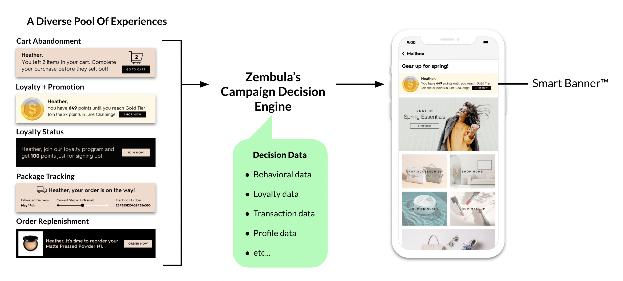
Smart Banners™ are dynamic, personalized content blocks that appear at the top of every email a brand sends. They’re part of the Zembula Dimensions™ platform and work by rendering personalized content at open time — not send time — using the subscriber’s current behavioral, transactional, and profile data.
When a subscriber opens an email, Zembula’s Decision Engine evaluates that individual’s data in real time and selects the most relevant message from over 100 behavioral use cases. A subscriber who abandoned a cart sees their carted items with a low-stock warning. A loyalty member close to a reward tier sees their points balance and what they need to unlock the next level. A subscriber who browsed a category yesterday sees those products alongside a personalized offer.
This happens automatically, in every email, without the marketing team building or scheduling any of it.
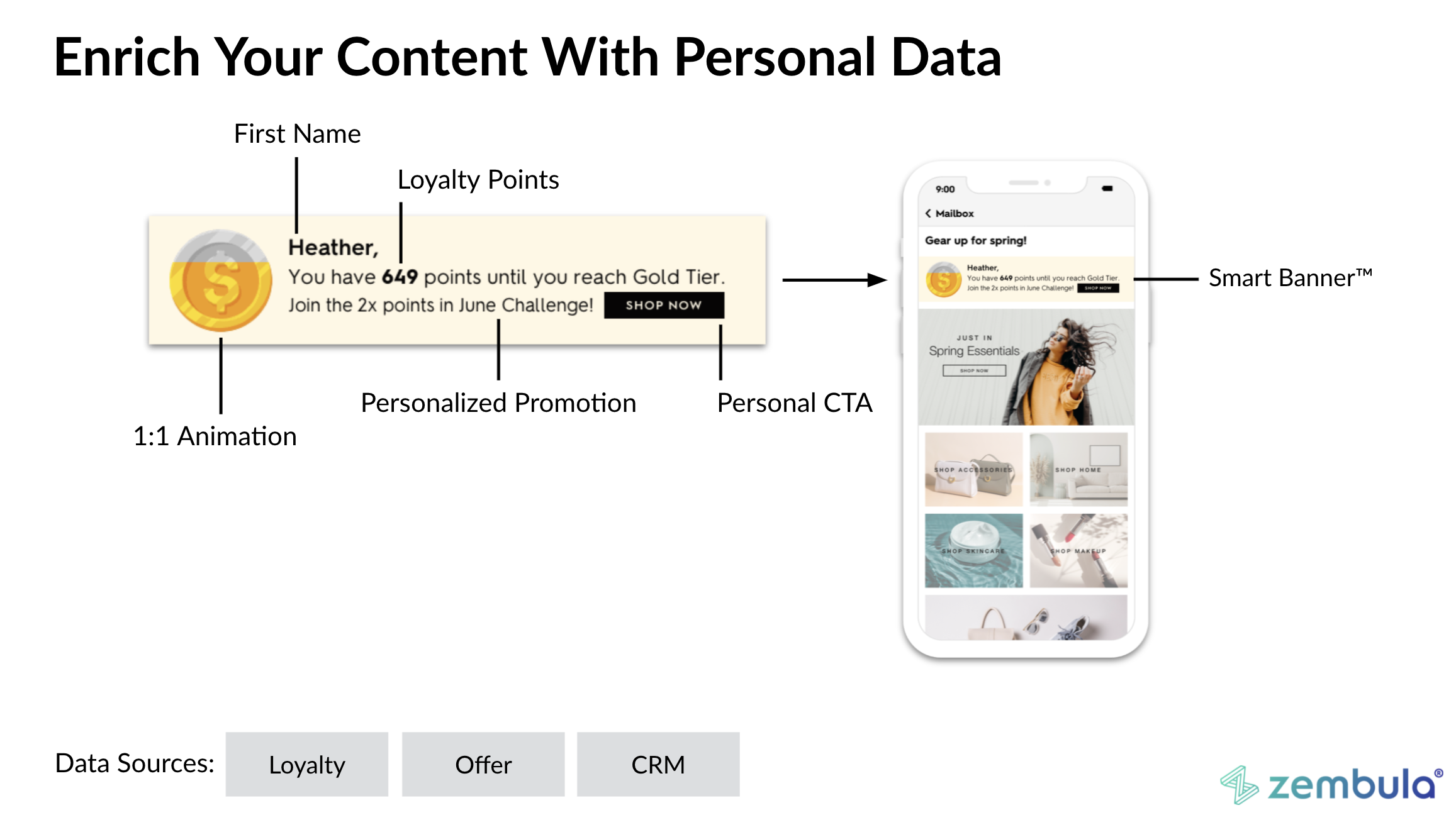
The implementation model is what makes this operationally viable. Smart Banners require a single snippet of code placed once in your email template. After that, personalization runs autonomously. There are no new workflows to build, no segments to maintain, no content calendars to manage for the banner layer. The marketing team continues sending campaigns exactly as they do today — the Smart Banner adds a personalized layer on top.
Smart Kickers extend the same concept to the bottom of the email, giving brands a second personalized touchpoint in every send. Combined, Smart Banners and Smart Kickers frame every email with content tailored to the individual subscriber.
In an era where the Promotions tab is the default destination for commercial email, visibility matters more than ever. Smart Banners ensure that the first thing a subscriber sees when they open any email — whether it’s a flash sale, a newsletter, or a transactional confirmation — is content that’s specifically relevant to them. That relevance is what drives engagement, clicks, and ultimately revenue.
The 3-Signal Framework: What Drives the Highest-Performing Banners
Across 6.2 billion email opens analyzed in the Zembula Q4 2025 Benchmark Report, a clear pattern emerged in the highest-performing Smart Banner configurations. The use cases that consistently drive the strongest results layer three distinct signals into a single banner.
Behavior + Personalization + Urgency
Behavior is what the subscriber did: browsed a product, added to cart, made a purchase, let a subscription lapse. It’s the “what happened” signal — the action that makes the message contextually relevant.
Personalization is who the subscriber is: their loyalty tier, their points balance, their purchase history, their preferences. It’s the “who you are” signal — the data that makes the message feel individually crafted rather than generically targeted.
Urgency is why they should act now: low inventory on a carted item, a coupon expiring tomorrow, a price drop on a browsed product, a reward about to expire. It’s the “why now” signal — the catalyst that converts interest into action.
Consider the difference. A banner that says “You left something in your cart” uses one signal (behavior). A banner that says “You left something in your cart — and you have 2,430 loyalty points to redeem” uses two (behavior + personalization). A banner that says “You left something in your cart — use your 2,430 loyalty points before they expire Friday, and hurry: only 3 left in stock” uses all three.
The performance gap between single-signal and three-signal banners is substantial. The full data — broken down by use case category, signal combination, and performance metric — is available in the Q4 2025 Benchmark Report.
Download the Q4 2025 Benchmark Report for the full data →
Smart Banner Use Cases That Drive Email Revenue
Smart Banners™ support over 100 behavioral use cases. Each one maps a subscriber’s real-time data to a specific, relevant message. The categories below represent the highest-impact groupings from Zembula’s benchmark analysis, ordered by overall revenue contribution.
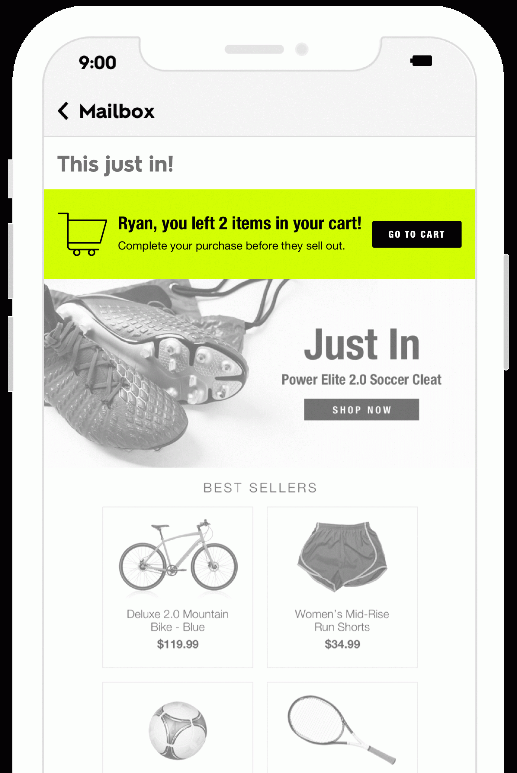
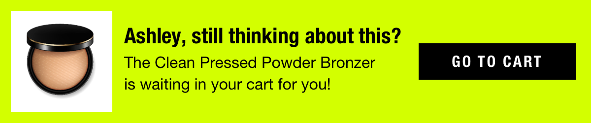
Abandoned Cart Email Recovery
Cart abandonment banners consistently rank as the highest-performing category across all metrics. They work because the behavioral signal is strong — the subscriber already demonstrated purchase intent — and the message is specific: these are the exact items you left behind. When paired with urgency signals like low inventory or expiring offers, abandoned cart banners turn every email the subscriber opens into a recovery opportunity, not just the dedicated cart abandonment flow.
Loyalty & Rewards
Loyalty-based banners deliver the highest conversion rates of any category despite sometimes generating more modest click-through rates. This makes sense: a subscriber who clicks a banner showing their exact points balance and what they can redeem has already self-qualified as a buyer. These banners are particularly effective when layered with behavioral signals — showing a loyalty member their points balance alongside products they’ve recently browsed creates a compelling reason to act.
Offer Management
Coupon and promotional banners perform well across the board, but their effectiveness increases substantially when paired with behavioral data. A generic “20% off” banner performs adequately. A banner showing “20% off the jacket you were looking at — offer expires tomorrow” performs dramatically better. Smart Banners allow brands to surface the right offer to the right subscriber at the right time, rather than blasting the same promotion to the entire list.
Abandoned Browse
Browse abandonment banners capture subscribers earlier in the purchase journey. The behavioral signal is weaker than cart abandonment — browsing indicates interest, not intent — so these banners rely more heavily on personalization and urgency signals to drive action. Birthday pairings consistently produce the strongest results within this category, combining the browse data with a high-engagement personalization moment.
Reviews & Social Proof
Social proof banners — star ratings, review counts, customer testimonials — are most effective when tied to high-intent behavioral signals. Showing reviews for a product someone carted outperforms showing reviews for a product someone merely browsed. The further along the purchase journey the subscriber is, the more social proof helps close the gap between consideration and conversion.
Call Outs: Low in Stock, Price Drop, Back in Stock
Inventory and pricing signals — low stock warnings, price drops, back-in-stock alerts — are urgency plays. On their own, they provide moderate value. But when paired with behavioral data (showing a low-stock warning for a product the subscriber actually carted or browsed), they become powerful conversion drivers. The benchmark data shows that unpaired call outs underperform significantly compared to call outs layered with cart or browse behavior.

Results From Real Brands
The 3-signal framework and use case strategy aren’t theoretical. Enterprise retailers are deploying Smart Banners™ at scale and measuring the impact directly.
Forever 21
Forever 21 launched Smart Banners with 52 active use cases and was fully operational within two weeks. The program delivered 11x return on ad spend (ROAS), turning a fast-fashion brand’s high-volume email program into a personalized revenue channel. With 52 use cases running simultaneously, every email in Forever 21’s program carries a relevant, individualized message — from cart recovery to loyalty nudges to inventory alerts.
Read the Forever 21 case study →
Thrive Causemetics
Thrive Causemetics deployed 67 use cases and achieved a 12x return on spend, with Smart Banners contributing a 17% lift in total email revenue. For a DTC beauty brand operating in a competitive category, that revenue lift came without adding a single new email to their calendar — the same sends, now individually personalized at the banner level.
Read the Thrive Causemetics case study →
J.Crew
J.Crew’s implementation demonstrates that even a focused set of use cases can deliver outsized results. With 19 active use cases, J.Crew achieved a 41x return on spend — the highest ROAS in Zembula’s published case studies. The results underscore that effective personalization isn’t about deploying every possible use case; it’s about deploying the right ones for your audience and product mix.
These brands join a roster of leading retailers using Zembula’s platform, including SPANX, NOBULL, and Sephora — companies that have made personalized email a competitive advantage rather than an aspirational line item on a roadmap.
How It Works: The Decision Engine and Implementation
Smart Banners™ are powered by Zembula’s Decision Engine — an AI-based system that evaluates each subscriber’s data at the moment they open an email and selects the most relevant banner in hundredths of a second.
Real-Time Decision Making
When a subscriber opens an email, the Decision Engine pulls their current behavioral, loyalty, transactional, and profile data. It evaluates every active use case — cart status, browse history, loyalty tier, available offers, inventory levels on relevant products — and determines which single message will have the highest impact for that subscriber at that moment.
This happens at open time, not send time. A subscriber who abandons a cart at 2 PM will see a cart recovery banner when they open that morning’s promotional email at 3 PM, even though the email was sent hours earlier. The content is always current because it’s rendered on demand.
Full Email Personalization
Smart Banners sit at the top of the email. Smart Kickers occupy the bottom. Smart Blocks can be placed anywhere in the email body. Together, they give brands the ability to personalize every section of every email without rebuilding their templates or content workflows.
The Zembula Dimensions™ platform manages all three, applying the same Decision Engine logic across each placement. A single email might show a cart recovery Smart Banner at the top, a loyalty points balance Smart Block mid-body, and a trending-in-your-size Smart Kicker at the bottom — all determined in real time for each subscriber individually.
Implementation: One Snippet, Zero Workflow Changes
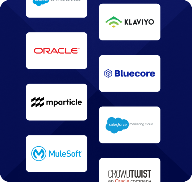
Implementation is a single code snippet added to your email template. It works with any ESP — Klaviyo, Braze, Salesforce Marketing Cloud, Iterable, or any platform that supports HTML email templates. Once the snippet is in place, Smart Banners begin rendering automatically in every email that uses that template.
There’s no daily operational overhead. The marketing team doesn’t need to select banners, build segments, or schedule content for the personalization layer. The Decision Engine handles use case selection autonomously based on subscriber data.
The typical pilot timeline is six weeks from kickoff to full deployment, with approximately six hours of total effort required from the customer’s team — primarily for data feed configuration and template snippet placement. Zembula’s team handles use case configuration, creative setup, and QA.
Get the Full Benchmark Data
This guide covers the framework. The numbers behind it are in the Q4 2025 Benchmark Report.
Based on 6.2 billion email opens across Zembula’s customer base, the report breaks down performance by use case category, signal combination, and metric — including the specific click-through-to-conversion rates and revenue-per-thousand figures that show exactly which configurations drive the most value.
If you’re evaluating Smart Banners for your email program, or trying to optimize an existing deployment, the benchmark report provides the data you need to prioritize use cases and set realistic performance expectations.
Download the Q4 2025 Benchmark Report →
See the full performance data for every use case category across 100+ behavioral configurations.
See Smart Banners in Action
The gap between what email personalization can do and what most brands actually deploy is the biggest untapped revenue opportunity in the channel. Smart Banners close that gap — automatically, in every email, starting in weeks.
If you’re sending more than a million emails a month and leaving the broadcast majority unpersonalized, the math is straightforward. Book a demo to see how Smart Banners would work with your email program, your data, and your use cases.
Grow your business and total sales