What Not To Do: Savage x Fenty Reveal Campaign


|
If you haven’t heard of Rihanna’s fabulous lingerie brand, Savage x Fenty, yet, you’ve clearly been living under a rock. This up-and-coming brand-for-all has a strong message of inclusivity, coupled with Rihanna’s obvious star power, making it a rising powerhouse in the oversaturated lingerie industry. Unfortunately, their recent email communication left a little something to be desired. Let’s dig deeper into an interactive content experience they’ve sent their customers, and see what they could have done differently.
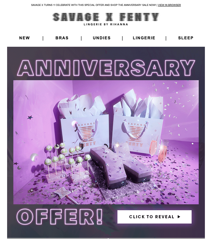
This actually starts out ok. A stylish GIF is the focal point here, along with a rather generic sounding “anniversary offer”. The CTA is definitely not awe-inspiring however, just stating “click to reveal”. On the plus side, they didn’t immediately give away what their offer is, so that’s a step in the right direction!

Once you click the CTA, you’re taken to a landing page with the image shown below.
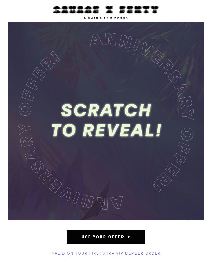
First of all, let’s talk about redirecting your traffic from email to a landing page (and a third-party one, at that!). This diverts your traffic away from where you want them: your website! They can’t purchase anything from you on a third-party landing page! Secondly, their “Scratch to Reveal” call won’t distract customers from the already-present CTA at the bottom of the experience. Why scratch when you could just immediately click through to the deal? Last, but certainly not least, using third-party links in email can actually harm your deliverability and sender reputation. We definitely don’t want that!
Once you finish interacting with the experience, this is what it looks like:
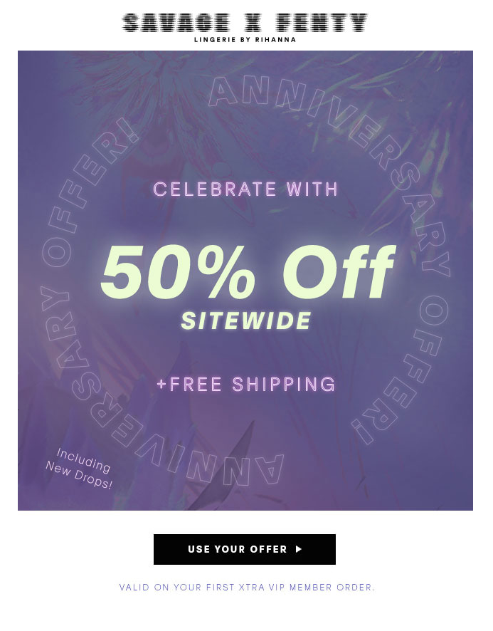
There is definitely not a great contrast between the cover and reveal images, making it harder to see where you’ve scratched off. The text colors also kind of disappear into the background, which makes it difficult to read. 50% off is a great deal, but this doesn’t really feel all that exciting to a potential customer.
All in all, this scratch experience from Savage x Fenty is a fairly poor example of a scratch-off. It not only sends you to a third-party landing page, but the CTA is constantly up, allowing you to skip the interaction altogether. The creative could also use some work, with a lackluster CTA and low-contrast imaging. Bold, contrasting reveal and cover images, combined with the ability to hide your CTA and direct traffic directly to your website with an overlay would take this particular experience from “ho-hum” to “wow!” in no time at all.
Interested in seeing how we could help you execute your own, awesome version of this kind of campaign that could net you 10x the clicks? Click here to chat with one of our experts.
|
|
